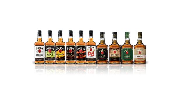
Expected to be rolled out across markets from mid-2016, the new design hopes to give the Jim Beam portfolio a unified, more premium look and feel. The UK will be the first market to receive the pack refresh, set to be on shelves from April, beginning with Jim Beam Bourbon and followed by Jim Beam flavours.
Also aimed at making the brand look more contemporary, the new Jim Beam bottle has a bolder structure with a clean label design, featuring premium finishes, refreshed distiller portraits and a refined "rosette" logo, harmonising the flavoured product range.
Jim Beam Devil's Cut and Jim Beam Rye feature a bolder, more rectangular bottle structure with premium label enhancements, including extra fine detailing, crafted borders, real gold foil finishes, refined embossing and matte paper stock. It also includes a matte finished shrink sleeve along the closure.
“This represents another historic milestone in my family’s history. I’ve always been proud to see the faces of every Beam Master Distiller displayed on Jim Beam bottles across the world and these bottles feel even better in my hands when pouring this fine bourbon", seventh Generation Master Distiller and Jim Beam’s Great-Grandson, Fred Noe, said.
As an ongoing evolution of Jim Beam’s successful Make History campaign, the premium packaging launch is being supported with in-store point of sale showcasing the upgraded bottles and advertising featuring global brand partner, Mila Kunis.
Share the content
