When it comes to talking about wine labels, it is evident that every brand is unified on one thing - that what’s on the outside of the bottle, is just as important as what’s on the inside.
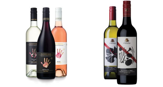
Handpicked Wines, which was voted as one of Australia’s ‘Top 10 Best New Wineries’ in James Halliday’s Wine Companion 2015, has won multiple awards for its wine labels. The winery’s Selections label won Best in Show at the Label and Tag Manufacturers Awards last year and picked up the World Trophy at the World Label Awards in Belgium in April. Following this, Handpicked’s Collection label received a gold medal at the National Print Awards.
It took the winery’s design and production team a staggering two years and multiple printing tests to develop its award-winning Selection label. Featured on wines that showcase classic varieties grown in their home country or region, the label aims to communicate a sense of place, which is depicted through the ‘Handpicked hand’ and a pattern unique to the wine that shows the landscape the variety was grown on, with intricate gold foiling and embossing.
The concept of creating a label specific to the wine is one that runs across Handpicked’s portfolio, with each of Handpicked’s tiers featuring a unique label, made using different printing and design techniques.
“The Regional Selections Handpicked range has always featured our iconic hand logo. When we launched two new premium tiers above this, we decided to broaden our packaging style to create a very unique set of labels that represent a sense of place and terroir in a non-traditional way, as well as justify their hierarchy within our portfolio,” Imogen Hayes, Handpicked Marketing Manager said.
“For our Collection and Single Vineyard wines, we collected objects from each wine region we produce in and photographed them in a studio. It was a very labour intense process, our winemakers thought that we were crazy, but the feedback has been overwhelmingly positive.”
Another of Australia’s well-known labels is from the family-owned d’Arenberg winery, located in McLaren Vale. The d’Arenberg name and label is recognised by many, in particular because of its iconic red stripe and crest, which were selected for the label by third generation family member, Francis ‘d’Arry’ d’Arenberg, in 1959.
Until recently, the original label d’Arry created for the winery had virtually remained the same. Over the last two years, the winery decided that it was time for a refresh to make the brand clearer and more contemporary. Each wine range was given its own unique personality and styling, with general changes rolled across the portfolio. The typography on the label was simplified, the red stripe now features more prominently, and the d’Arenberg logo was redrawn and modernised.
Principal and Creative Director of d’Arenberg’s award-winning Adelaide design team Voice, Scott Carslake said, “When we were redesigning all of d’Arenberg’s labels, because they have quite a lot of equity in the red stripe, part of our process was to further emphasise that feature. We want people to instantly recognise the label as being a d’Arenberg product at just a glance, and the red stripe helps to achieve that.”
Last year, Taylors Wines released an innovative label, using thermochromic ink, that is able to tell consumers when the wine is at the best temperature for consumption. The technology has been hugely successful, proving to be an essential and educational tool for consumers, as well as paving the way for future thermal technology within the industry.
Consumers can track the temperature of the wine by comparing the colour shown on the thermochromic ink panel with a colour chart.
“Taylors Optimum Drinking Temperature Sensors were born from a few insights into wine drinking behaviour. The main one being that Australia has a great wine growing climate, but a poor wine drinking climate,” Pieter Klein, New Product Development Manager at Taylors Wines explained. “The temperature of an average Aussie home, particularly in summer, ranges between 22˚C-24˚C, and according to industry experts, including the Court of Master Sommeliers, serving a red wine at this temperature robs it of its finesse and flavour."
Klein added: “For our whites, the sensor changes from a vibrant yellow, to a deep blue when the wine is extremely chilled, warming back to a rich lime green colour when the wine is at the optimum drinking temperature. For reds, the wine begins at a faint purple, changing to a dark purple colour when the wine is chilled too far, coming back to a rich fuchsia colour when the wine is just right.”
Share the content
